

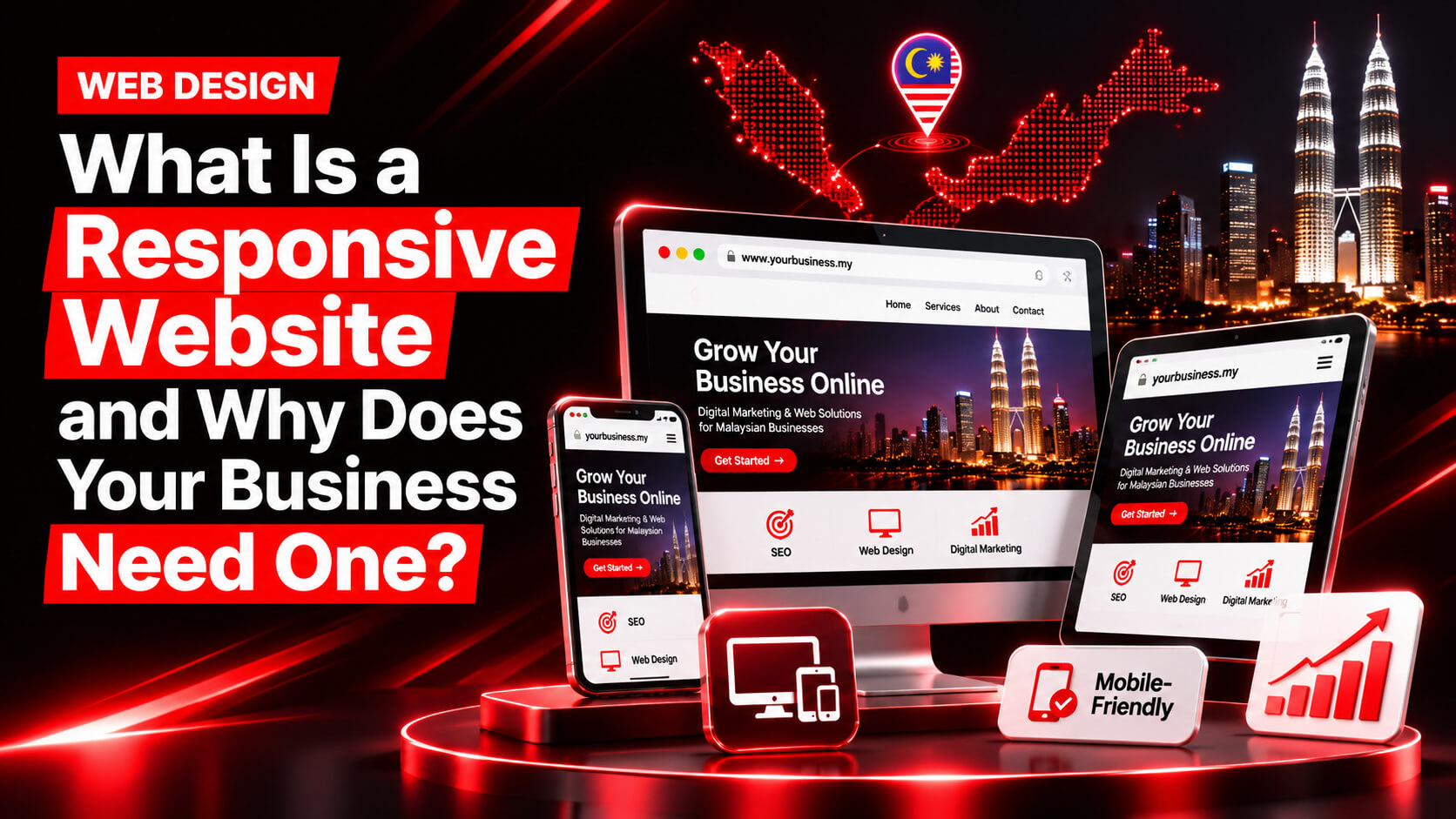
What Is a Responsive Website and Why Does Your Business Need One?
Imagine a potential customer searching for your business on Google using their smartphone. They find your website, click the link, and discover that the text is too small, images are overflowing, and the navigation menu is difficult to use. What happens next? Most likely, they leave and visit a competitor’s website instead.
This is exactly why responsive website design matters.
A responsive website is a website that automatically adjusts its layout, images, text, navigation and other elements to fit different screen sizes and devices, including smartphones, tablets, laptops and desktop computers.
For Malaysian businesses, having a responsive website is no longer simply a design preference. It is an important part of providing a better user experience, supporting search engine visibility, building customer trust and generating more enquiries online.
Whether you operate an eCommerce store, professional service company, restaurant, corporate organisation or local business in Malaysia, a mobile-friendly website helps potential customers access your business information wherever they are.
In this guide, we explain what responsive web design means, how it works, its benefits for businesses and why investing in professional website development can support your long-term digital growth.
What Is a Responsive Website?
A responsive website is a website designed to automatically adapt its appearance and functionality to the screen size and device being used by a visitor.
Instead of creating separate websites for mobile phones, tablets and desktop computers, responsive web design uses a flexible layout, fluid grids, scalable images and CSS media queries to deliver an appropriate viewing experience across different devices.
For example:
- On a desktop computer, a website may display a navigation menu across the top, multiple content columns and large images.
- On a tablet, the same layout may reorganise into fewer columns with appropriately sized content.
- On a smartphone, the navigation may become a compact menu, content may appear in a single column, and buttons may become easier to tap.
The website retains its essential content and functionality while adjusting its presentation to the available screen space.
In simple terms, a responsive website looks and works properly regardless of whether someone visits it using an iPhone, Android smartphone, iPad, laptop or desktop computer.
This approach is known as responsive web design (RWD), and Google recommends it as an effective configuration for building mobile-friendly websites.
How Does Responsive Web Design Work?
Responsive web design combines several technical elements to ensure a website adapts to different devices.
Understanding these elements helps business owners recognise what goes into building a properly responsive website.
1. Flexible Grid Layouts
A flexible grid allows website elements to adjust their widths according to the available screen space.
Traditional fixed-width layouts may work on desktop computers but often create horizontal scrolling on smaller screens.
Responsive layouts use relative measurements, such as percentages and flexible CSS units, instead of relying entirely on fixed pixel dimensions.
For example, a three-column service section on a desktop can automatically become a single-column layout on a smartphone.
2. CSS Media Queries
CSS media queries allow developers to apply different styling rules depending on the characteristics of a visitor’s device or viewport.
For instance, a website may display three service cards in one row on a desktop, two columns on a tablet and one card per row on a smartphone.
This makes it possible to create device-appropriate layouts without maintaining multiple versions of the same website.
3. Responsive Images and Media
Images that look appropriate on desktop screens may become oversized or distorted on mobile devices if they are not properly optimised.
Responsive image techniques allow images to scale within their containers while maintaining their aspect ratios.
Developers can also use appropriately sized image variations to reduce unnecessary downloads and improve loading performance.
4. Flexible Typography
Text must remain readable across different screen sizes.
Responsive typography adjusts font sizes, line heights, spacing and text widths to maintain readability.
For example, a large desktop heading may use a smaller font size on mobile devices to prevent unwanted line breaks or overflowing text.
5. Mobile-Friendly Navigation
Navigation is another essential part of responsive website development.
Desktop websites commonly use horizontal navigation menus. However, these menus may not fit comfortably on smaller screens.
Responsive navigation can use collapsible menus, dropdowns or mobile navigation panels to help visitors find important information without unnecessary scrolling.
Responsive Website vs Mobile-Friendly Website: What Is the Difference?
Although these terms are often used interchangeably, they do not always mean exactly the same thing.
A mobile-friendly website describes a website that provides a usable experience on smartphones and other mobile devices.
A responsive website uses a specific design and development approach that automatically adapts the layout to different screen sizes.
Here is a comparison:
| Feature | Responsive Website | Basic Mobile-Friendly Website |
| Layout | Automatically adjusts to screen sizes | May use limited mobile adjustments |
| Devices | Desktop, tablet and mobile | Primarily designed for mobile usability |
| Images | Flexible and scalable | May have limited image adjustments |
| Navigation | Adapts to available screen space | May use a simplified menu |
| Content | Maintains consistent content across devices | May offer a reduced mobile experience |
| Maintenance | Generally easier with one responsive layout | Depends on implementation |
A properly developed responsive website provides a consistent experience across different devices rather than simply making a desktop website smaller.
For most businesses, responsive web design is a practical long-term approach because it combines usability, maintainability and search accessibility.
Why Does Your Business Need a Responsive Website?
A business website is often the first place potential customers visit before deciding whether to contact a company, request a quotation or make a purchase.
If your website is difficult to use on mobile devices, you may lose valuable business opportunities.
Here are seven important reasons why Malaysian businesses should invest in responsive website design.
1. Reach Customers on Smartphones and Tablets
People use different devices to search for products, compare services, read reviews and contact businesses.
A customer might discover your company through Google while travelling, research your services on a laptop and return later using a smartphone.
A responsive website allows customers to access the same essential information regardless of their device.
For Malaysian businesses targeting customers across Kuala Lumpur, Petaling Jaya, Selangor, Johor Bahru and other locations, this accessibility is particularly important.
Your website should make it easy for visitors to:
- Explore your products and services.
- Read company information.
- View pricing and service details.
- Find your business location.
- Contact your team.
- Submit enquiries or make purchases.
When visitors can complete these actions comfortably on their devices, your website becomes a more useful business asset.
2. Improve Your Google Search Visibility
Responsive web design supports search engine optimisation (SEO) by providing a consistent website experience across devices.
Google primarily uses the mobile version of website content for indexing and ranking through its mobile-first indexing system.
This means Google generally evaluates the mobile version of your website when determining how its pages should appear in search results.
A properly developed responsive website helps maintain:
- Consistent page content across devices.
- The same URL structure.
- Accessible navigation and internal links.
- Consistent metadata.
- Crawlable website content.
- A unified website architecture.
Responsive design alone does not guarantee higher Google rankings. However, it provides a strong technical foundation for mobile SEO.
For companies competing in Malaysian search results, this foundation can support broader SEO activities, including content optimisation, technical SEO and local search optimisation.
3. Provide a Better User Experience
User experience (UX) describes how easily visitors can interact with your website and complete their intended actions.
A website that requires visitors to zoom in, scroll horizontally or struggle with navigation creates unnecessary friction.
Responsive web design helps remove these problems.
Consider a customer searching for a web development company in Malaysia. They want to understand your services, view previous projects and request a consultation.
If the website is difficult to navigate on a smartphone, they may leave before reaching your contact page.
A responsive website makes important information easier to access through:
- Readable text.
- Properly sized buttons.
- Organised content sections.
- Easy-to-use navigation.
- Properly displayed images.
- Clear calls to action.
A better user experience helps visitors interact with your business more confidently.
4. Increase Enquiries and Conversion Opportunities
Getting website traffic is only one part of digital marketing. Your website should also encourage visitors to take meaningful actions.
These actions are known as conversions.
Depending on your business model, conversions may include:
- Submitting a contact form.
- Requesting a service quotation.
- Booking an appointment.
- Making an online purchase.
- Clicking a WhatsApp contact button.
- Calling your business.
- Registering for a service.
Responsive web design helps make these conversion opportunities accessible across different devices.
For example, a Malaysian service business can display a prominent WhatsApp button on mobile screens, allowing interested customers to contact its team directly.
Similarly, an eCommerce website can provide a simplified mobile checkout experience to reduce unnecessary purchasing friction.
The goal is to make the next step clear and convenient for every visitor.
5. Reduce Website Maintenance Complexity
Imagine managing three separate website versions: one for desktop, another for tablets and a third for smartphones.
Every time you update your services, pricing, images or contact information, you may need to make changes across multiple versions.
This creates additional maintenance work and increases the possibility of inconsistent information.
A responsive website generally uses one website structure and URL for all devices.
This makes it easier to:
- Update website content.
- Manage products and services.
- Maintain navigation menus.
- Implement technical SEO improvements.
- Publish new landing pages.
- Manage website security and updates.
For growing Malaysian businesses, this can simplify website management and support long-term digital operations.
6. Build Customer Trust and Brand Credibility
Your website represents your business online.
An outdated website with broken layouts, unreadable text or poorly displayed images can create a negative first impression.
On the other hand, a professionally designed responsive website demonstrates attention to detail and makes your business easier to interact with.
Brand consistency is also important.
Your logo, colours, typography, images and messaging should remain recognisable across smartphones, tablets and desktop computers.
Whether someone visits your website from Kuala Lumpur, Penang, Johor Bahru or another Malaysian location, the experience should reflect the same professional brand identity.
7. Support Long-Term Business Growth
Your website should be able to support your business as it grows.
You may initially operate with a few service pages, but later introduce additional services, product categories, online booking features or eCommerce functionality.
A responsive website provides a flexible foundation for these developments.
It can support:
- New service pages.
- Additional product categories.
- Blog and resource sections.
- Online enquiry systems.
- Appointment booking functionality.
- Marketing landing pages.
- Integration with analytics and marketing tools.
Instead of treating your website as a one-time digital brochure, you can develop it into a platform that supports ongoing marketing and business growth.
What Happens If Your Website Is Not Responsive?
A non-responsive website can create several problems for your business, particularly when visitors access it using smartphones.
Some common issues include:
Horizontal scrolling: Visitors must move the screen sideways to read content or view images.
Unreadable text: Small fonts make it difficult to understand information without zooming in.
Broken layouts: Images, buttons and content sections may overlap or extend beyond the screen.
Difficult navigation: Desktop menus may not work properly on mobile devices.
Poor conversion experience: Contact forms, checkout pages and buttons may become difficult to use.
Search accessibility issues: If important content or links are unavailable on mobile, Google may have difficulty accessing the same information it needs for indexing.
These issues can affect user satisfaction and create unnecessary barriers between your business and potential customers.
Essential Features of a High-Quality Responsive Business Website
Not every website described as mobile-friendly provides a genuinely good mobile experience.
A professional responsive website should combine visual flexibility, technical performance and conversion-focused functionality.
Here are the features businesses should look for.
| Feature | Why It Matters |
| Mobile-first layout | Prioritises usability on smaller screens |
| Flexible images | Prevents distortion and overflowing content |
| Responsive typography | Keeps text readable on different devices |
| Mobile-friendly navigation | Makes important pages easier to access |
| Fast loading speed | Reduces waiting time for visitors |
| Clear CTA buttons | Encourages enquiries and conversions |
| Secure HTTPS connection | Protects data transferred between visitors and the website |
| SEO-friendly structure | Helps search engines understand website content |
| Accessible design | Makes content easier to use for a wider audience |
| Consistent functionality | Keeps important features working across devices |
A professional website developer should test these features across multiple screen sizes before launching the website.
How to Check Whether Your Website Is Responsive
If you already have a business website, you can perform a basic responsiveness check without advanced technical knowledge.
Follow these steps:
Step 1: Open Your Website on a Smartphone
Visit your website using an Android phone or iPhone.
Check whether the text is readable, images fit the screen and navigation works properly.
Step 2: Test Different Screen Sizes
Open your website on a tablet, laptop and desktop computer.
Look for overlapping content, broken layouts and unnecessary horizontal scrolling.
Step 3: Check Navigation and Buttons
Try using your menus, contact forms, WhatsApp buttons and other interactive elements.
Make sure buttons are easy to tap and important links work correctly.
Step 4: Check Website Loading Performance
Use Google’s PageSpeed Insights to evaluate your website’s performance on mobile and desktop devices.
Pay particular attention to Core Web Vitals:
- Largest Contentful Paint (LCP): Measures loading performance.
- Interaction to Next Paint (INP): Measures interaction responsiveness.
- Cumulative Layout Shift (CLS): Measures visual stability.
Google’s current recommended good thresholds are:
- LCP: 2.5 seconds or less.
- INP: 200 milliseconds or less.
- CLS: 0.1 or less.
Step 5: Review Mobile Search Accessibility
Check whether important content, headings, images and internal links are available on the mobile version of your website.
Remember that a website can be responsive but still have performance, usability or technical SEO problems. All these areas should be evaluated together.
Why Malaysian Businesses Should Invest in Professional Website Development
Malaysia has a competitive digital business environment. Companies across industries use websites to attract customers, showcase their expertise and generate enquiries.
Whether you operate a corporate business in Kuala Lumpur, a professional service company in Petaling Jaya, an online store in Johor or a local business in Selangor, your website needs to work effectively across different devices.
Choosing professional website development in Malaysia can help ensure that your website is designed around your actual business requirements.
A professional web development process should consider:
Business objectives: Understanding whether your website needs to generate leads, sell products, promote services or build brand awareness.
Target audience: Identifying the types of customers visiting your website and the devices they commonly use.
Website architecture: Organising pages, menus and internal links so visitors can find relevant information.
Responsive design: Ensuring layouts, images, navigation and interactive elements adapt to different screen sizes.
Technical SEO: Implementing clean URLs, structured headings, appropriate metadata and crawlable content.
Website performance: Optimising images, scripts, code and other resources to support faster loading.
Conversion optimisation: Making it easy for visitors to request quotations, contact your team or purchase products.
These considerations should be included from the beginning rather than treated as separate tasks after the website has been launched.
Why Choose BlackRevo for Responsive Website Development in Malaysia?
If your business needs a new website or an existing website requires a complete redesign, working with a team that understands both web development and SEO can make a difference.
BlackRevo is an SEO and web development agency based in Kota Damansara, Petaling Jaya, Malaysia. The agency focuses on building fast, search-ready and conversion-focused websites that support measurable business growth.
Rather than focusing only on visual appearance, BlackRevo approaches website development with three important priorities.
SEO-Ready Website Architecture
A business website needs more than attractive design.
Its technical structure should support search engine crawling, indexing and content discovery.
BlackRevo integrates SEO considerations into the development process, including clean website architecture, semantic heading structures, schema markup and search-friendly URLs.
Responsive Design and Website Performance
Your website should provide a smooth experience across smartphones, tablets and desktop computers.
BlackRevo focuses on clean development, optimised assets and mobile performance, with attention to Google’s Core Web Vitals.
Conversion-Focused Website Development
A business website should help visitors take the next step.
Whether that means requesting a quotation, contacting your team through WhatsApp or exploring your services, the website layout should make these actions clear and accessible.
Looking for professional website development in Malaysia?
Explore BlackRevo’s Website Development Services to discover how a strategically developed, responsive and SEO-ready website can support your business objectives.
You can also visit BlackRevo to learn more about its SEO and digital growth services.
Final Thoughts
A responsive website is an essential part of building a strong online presence.
It allows your business to provide a consistent experience across smartphones, tablets and desktop computers while supporting usability, search accessibility and conversion opportunities.
For Malaysian businesses, investing in responsive website development is not just about making a website look good on a mobile screen. It is about creating a reliable digital platform that helps customers discover your business, understand your services and take action.
If your current website is difficult to use on mobile devices, loads slowly or fails to generate enquiries, it may be time to consider a professional website redesign.
Build a website that works for your customers and your business with BlackRevo’s professional web development services in Malaysia.
Frequently Asked Questions (FAQs)
1. What is a responsive website in simple terms?
A responsive website is a website that automatically adjusts its layout, images, text and navigation to fit different screen sizes. It allows visitors to use the same website comfortably on smartphones, tablets, laptops and desktop computers.
2. Why is responsive web design important for businesses in Malaysia?
Responsive web design helps Malaysian businesses reach customers using different devices. It improves mobile usability, supports Google’s mobile-first indexing, provides easier access to business information and creates more opportunities for customer enquiries and sales.
3. Does a responsive website improve Google rankings?
Responsive design supports SEO by providing a consistent website experience across devices and making website content easier to access. Google uses mobile-first indexing, meaning it primarily uses the mobile version of a website for indexing and ranking. However, responsiveness alone does not guarantee higher rankings.
4. What is the difference between responsive and adaptive web design?
Responsive web design uses flexible layouts that continuously adjust according to the available screen space. Adaptive web design generally uses predefined layouts for specific screen sizes or device categories. Both approaches can support mobile usability, but they work differently.
5. How much does responsive website development cost in Malaysia?
The cost depends on the website’s complexity, number of pages, design requirements, functionality and integrations. A simple business website generally requires less development work than a customised eCommerce platform or complex web application. Malaysian businesses should request a project quotation based on their specific requirements.
6. How can I make my existing website responsive?
You can make an existing website responsive by updating its layout, implementing flexible grids, adding appropriate CSS media queries, optimising images, improving typography and adapting navigation for smaller screens. Depending on the website’s existing technical structure, a redesign or redevelopment may be more practical.
7. Is responsive web design necessary for an eCommerce website?
Yes. An eCommerce website should provide a smooth shopping experience across different devices. Responsive product pages, readable descriptions, accessible filters, mobile-friendly navigation and simplified checkout processes help customers browse and purchase products more conveniently.
8. How do I test whether my website is mobile responsive?
Open your website on different smartphones, tablets and desktop devices. Check text readability, image scaling, navigation, buttons and forms. You can also use Google’s PageSpeed Insights to evaluate mobile performance and Core Web Vitals.
9. Does a responsive website load faster on mobile devices?
Not automatically. Responsive design adapts the layout to different screen sizes, but loading speed also depends on image optimisation, hosting, caching, scripts, CSS and overall website architecture. Proper development and performance optimisation are necessary to achieve fast loading times.
10. Where can I find professional responsive website development services in Malaysia?
Malaysian businesses can work with a professional web development agency that understands responsive design, technical SEO, website performance and conversion optimisation. BlackRevo, based in Kota Damansara, Petaling Jaya, provides website development services focused on building search-ready and performance-oriented business websites.
Recent Posts


November 16, 2026
What Is a Responsive Website and Why Does Your Business Need One?

November 13, 2026


Leave a comment